


Blog navigation

 0
0
Timeless and deep, this shade is similar to dark red: we named burgundy. It is part of the red range with deep shades, softened by a hint of purple.
Its name comes from Bordeaux wine because as it ages its color changes appearance. It has many shades of color.
FEATURES
This elegant color brings warmth and character to the decoration. It remains bright even with its underside -dark tones. Ideal for fall and winter because its colors create a warm and cozy atmosphere in your home.
Burgundy should be balanced with a lighter, natural palette in order to highlight it. It is recommended to use it sparingly by incorporating it via different accessories or textile elements.
BORDEAUX - COLORS AND MATERIALS
The strength of this shade is to combine with very varied colors:
- Mustard yellow
- Bright orange
- Green (moss green or sea green)
- Charcoal gray
- Powder pink
The tones that match best with burgundy will undoubtedly remain black and gold. It catches the eye and makes a difference in a neutral decoration.
In addition to associating it with colors, don't hesitate to do the same with the different materials present in your home.Burgundy and wood make the interior more chic while metal gives the room an industrial style.
USES - PER PIECE AND SPARING
Burgundy is mainly used in walk-through rooms. For other spaces in your home, we advise you to add decorative elements instead.
BORDEAUX IN A ROOM
What is a passage room? A corridor or an entrance, you don't live there and these spaces take you from point A to point B in your interior. Applying this color to a section of wall is a good idea. It is a color that creates a welcoming atmosphere.
Tip:if your hallway seems too big, don't hesitate to add paint or wallpaper to reduce its depth.
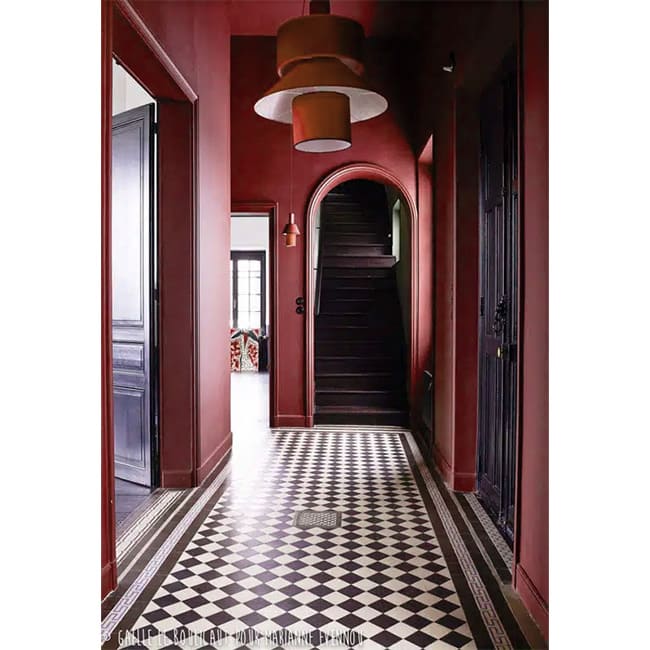
Don't want to colorize a section of wall? We share several tips with you to integrate it into your home.
BORDEAUX IN SMALL TOUCHES
There are different ways to add color to your interior.
Let's return to the entry; Don’t you like painting an entire wall? Add accent lamps with shades to integrate it more simply.
Another tip for not painting an entire wall: use patterned wallpaper. This will add relief and promote the integration of the color.
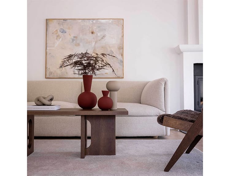
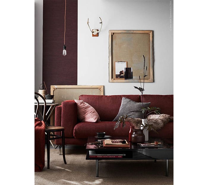
In a living room, it is possible to paint a section of wall as for the entrance. You also have the choice of leaving your wall the initial color and playing with the decorative elements. For example, choose a sofa or armchair in this color, add cushions to your sofa…

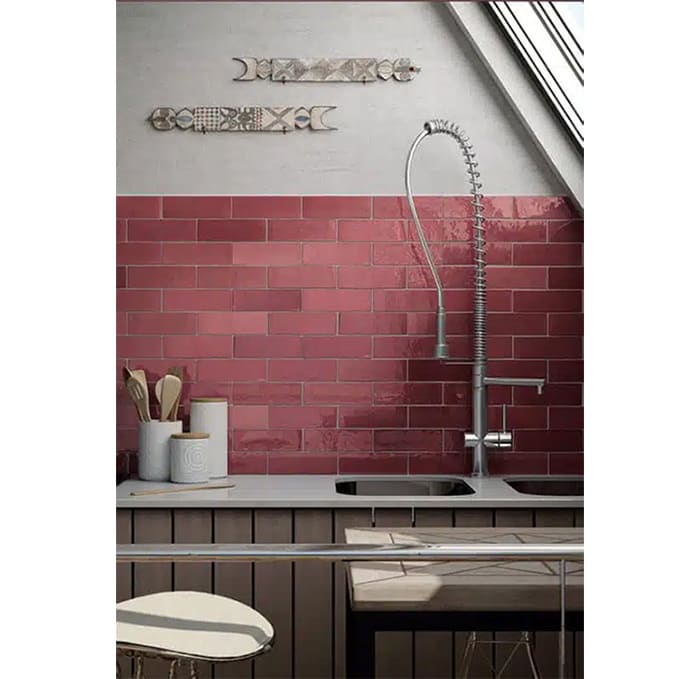
For the kitchen, opt for burgundy earthenware, utensils or table service.
In order to add color to your interior in small quantities here are some decorative elements:
- Lamp
- Carpet
- Ceramic vase
- Cushions
- Duvet / plaid set
To be selected according to your needs and the surface to be decorated.
Burgundy is a complex color to integrate into your interior with its “dark” shade. It invites the warmth and cocooning spirit of the room. By integrating it by touch with paint, wallpaper, decorative elements or furniture, this color will make all the difference in your interior and attract the eye.
If burgundy is not your favorite color, do not hesitate to read our articles on the duck blue, the terracotta or even the water green to find your happiness.
Related posts
-
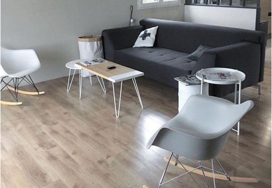
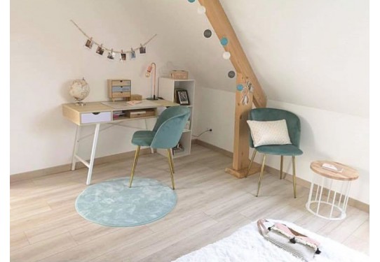
 An atmosphere inspired by the Scandinavian style │ Style game # 6
Because it perfectly shows how the subtlety of materials, furniture and colors can create a refined and warm style,...
An atmosphere inspired by the Scandinavian style │ Style game # 6
Because it perfectly shows how the subtlety of materials, furniture and colors can create a refined and warm style,... -
Little foot will become big! La Fabrique is also furniture for children and teenagers!
In the mind of a fabricator, when we think of furniture, we think of foot and when we think of foot, we think of...
-
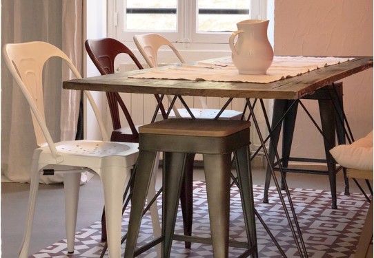
An industrial chic atmosphere… in the countryside │ Style game # 5
This dining room perfectly shows how the subtlety of materials, furniture and colors can create a refined and warm...
Leave a comment